

Table of Contents
- Start With a Visual Narrative, Not a Shopping List
- Affordable Coastal Home Decor Ideas for Beginners
- Cohesive Home Decor Styling Tips That Actually Work
- How to Style a Living Room With Curated Accents
- Layer Lighting to Change How Curated Accents Read
- Mix Styles Without the Mess: Contemporary Meets Vintage
- Renter-Friendly Curated Accents You Can Take With You
- Conclusion
- Frequently Asked Questions
Last Updated: September 23, 2026
Start With a Visual Narrative, Not a Shopping List
Most people decorate backwards. They buy a vase because it's pretty, then hunt for a spot to put it. The result is a room full of nice things that don't talk to each other. A visual narrative flips that order. You decide what the room should say, then buy pieces that say it. Curated accents are the small, deliberate objects, pillows, vases, art, and throws, that carry that story from one corner of a room to the next.
Affordable Coastal Home Decor Ideas for Beginners
Coastal style is the easiest entry point for new decorators. It relies on a tight palette of sand, white, soft blue, and natural fiber, so almost anything you pick in those tones will work together. That built-in color harmony does the heavy lifting for you.
Budget-Friendly Accent Pieces That Read Coastal
You don't need a beach house to get the look. A few well-chosen pieces carry it:
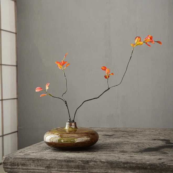
- A neutral ceramic vase in grey or white, styled with dried stems
- Woven baskets or jute rugs for texture underfoot
- Linen or cotton throw pillows in soft blues and creams
- Driftwood-toned frames or simple abstract wall art
- A single piece of statement lighting in rope, rattan, or matte white
Where to Save and Where to Spend
Spend on pieces you touch and look at daily: pillows, rugs, and lighting. Save on the small filler objects that rotate with the season. Here's a simple split:
Category |
Spend Level |
Why |
|---|---|---|
Throw pillows |
Spend |
Handled daily, sets the palette |
Rugs |
Spend |
Anchors the whole room |
Vases |
Save |
Easy to swap, low wear |
Wall art |
Save |
Trend-driven, easy to replace |
Baskets and trays |
Save |
Functional, forgiving |
Cohesive Home Decor Styling Tips That Actually Work
Cohesion comes from repetition, not from matching sets. Pick three colors and two textures, then repeat them in every zone of the room. That's the whole trick, and it's why some rooms feel calm while others feel cluttered.
The Rule of Three and Other Composition Basics
The rule of three says odd-numbered groupings read as more natural to the eye. Style vases, books, or candles in threes rather than pairs. Vary the height: one tall, one medium, one short. Keep the tallest item off-center for visual balance.
A few more basics that hold up in practice:
- Anchor first. Place your largest piece, then build outward.
- Leave negative space. Empty surface area is part of the composition.
- Repeat a color three times. Once in art, once in a pillow, once in a small object.
- Mix heights and depths. Flat arrangements look like a shelf, not a vignette.
How to Style a Living Room With Curated Accents
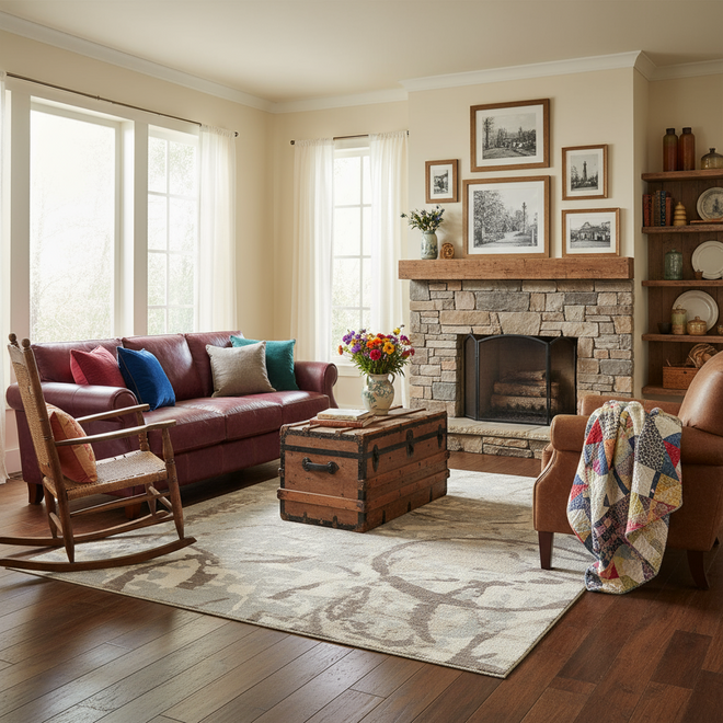
Start with the sofa, then work outward in layers: rug, pillows, throw, art, lighting, then small objects. This order keeps you from overbuying, because each layer tells you what the next one needs.
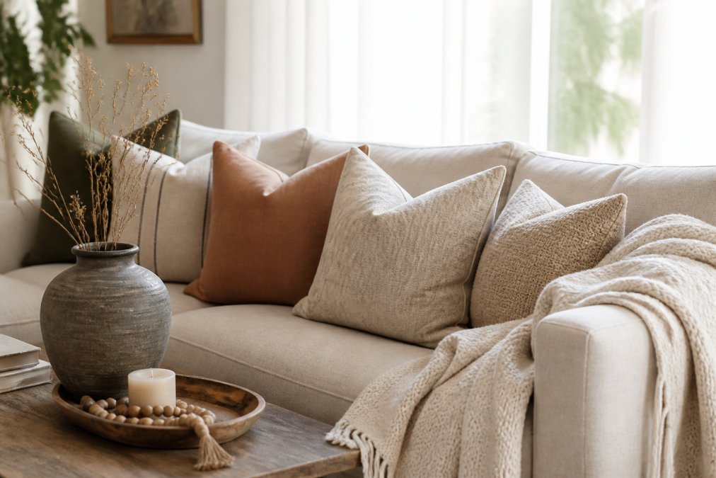
Living room sofa styled with layered throw pillows, a ceramic vase, and a woven blanket as curated accents.
Here's the sequence that works:
- Lay the rug. It defines the seating zone and sets your palette.
- Add pillows in odd numbers. Three or five, mixed sizes.
- Drape a throw. It softens hard lines and adds texture.
- Hang art at eye level. Center it over the sofa, about 8 to 10 inches above the back.
- Place a vase with stems. This is your focal point on the coffee table or console.
- Finish with small objects. A tray, a candle, a stack of books.
Layer Lighting to Change How Curated Accents Read
Lighting is the layer most people skip, and it's the one that changes everything. A vase looks flat under one overhead bulb. Add a table lamp at a different height and the same vase gains shadow, depth, and warmth. This is the technical gap most decor articles leave open: they tell you to "add layers" without explaining what each layer actually does to a curated object.
The Three Layers and What Each One Is For
- Ambient: your main ceiling light or a large floor lamp. Its job is to make the room usable, not to make objects look good. Ambient light alone is why so many rooms feel flat.
- Task: a reading lamp, under-cabinet light, or desk lamp. Its job is directed brightness for a specific activity.
- Accent: a small lamp, picture light, or candle aimed at one object. Its job is to create a pool of light and a pool of shadow around a single curated piece. This is the layer that produces the showroom effect.
The Mechanism: Why Accent Light Creates Depth
A curated object reads as three-dimensional only when light hits it from an angle and leaves part of it in shadow. Overhead light arrives from directly above, flattens the form, and kills the shadow that gives a ceramic glaze or a woven basket its texture. An accent light placed to the side and slightly in front of the object, roughly at the object's mid-height, not above it, throws a soft shadow behind and beside it.
Neutral Simple Two-Toned Ceramic →
Color Temperature: The Number That Changes Everything
Bulb color is measured in Kelvin (K), and it changes how your materials look:
- 2700K (warm): flatters wood, ceramic, brass, and textiles. The default for living rooms and bedrooms.
- 3000K (soft white): slightly cooler, still warm enough for living spaces, common in kitchens.
- 4000K and up (cool): makes wood and ceramic look grey and clinical. Fine for garages and utility areas, wrong for curated decor.
A Simple Placement Sequence
- Turn off the overhead light.
- Place one accent lamp beside your focal object, at roughly its mid-height.
- Step back and look for the shadow. If there's no shadow, move the lamp closer or to a sharper angle.
- Add a second accent light on the opposite side of the room at a different height so the eye has two pools of light to travel between.
- Only then turn the ambient light back on, and dim it if you can.
Mix Styles Without the Mess: Contemporary Meets Vintage
Mixing eras works when you follow one rule: keep the palette tight and let the shapes do the talking. A modern sofa with a vintage side table looks collected. The same sofa with five competing wood tones looks like a storage unit. The difference is almost never the pieces themselves, it's whether the room has a single visual through-line holding them together.
Why Mixing Eras Feels Good, Not Just Looks Good
There's a reason a well-mixed room reads as calm rather than chaotic.
The Mechanics of a Clean Mix
Four levers control whether a mixed room reads as collected or cluttered:
- Palette discipline. Hold to two or three colors across every era. A vintage piece in your palette reads as intentional; the same piece in an off-palette color reads as a mistake.
- Wood-tone limit. Cap yourself at two wood tones per room. Three or more is the single fastest way to make a mix look like a storage unit.
- Shape contrast. Pair one curved or organic piece with one clean-lined piece. Two curvy pieces compete; two straight pieces go flat.
- Proportion anchor. Give the vintage piece a job, side table, lamp base, tray, rather than letting it float as pure decoration.
Pairings That Hold Up
- Clean-lined contemporary seating with one antique wood piece (side table, stool, or frame)
- Matte ceramic vases with a single brass or aged-metal accent, one metal, not three
- Neutral textiles with one patterned vintage textile, used as the only pattern in the room
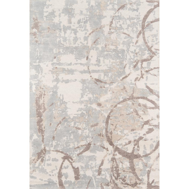
- A modern rug under a vintage chair, or the reverse, but never two strong patterns at floor level
Bridge Pieces That Do the Work for You
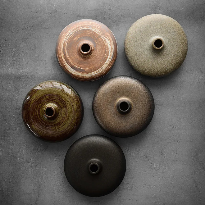
The Sculpted Waves White Ceramic Scandi Vase at $168.00 is a strong bridge piece. Its organic wave detail nods to vintage craft, while its clean Scandinavian lines keep it firmly modern. For a softer Nordic look, the Brushed Handmade Ceramic Modern Minimalist Vases at $106.00 bring handmade texture that pairs well with older wood furniture. Both work because they sit in the middle of the era spectrum, they don't force you to pick a side.


Renter-Friendly Curated Accents You Can Take With You
Renters face one real constraint: nothing permanent. The fix is to decorate in layers that travel. Skip wallpaper, built-ins, and anything that needs a drill. Focus on pieces that sit, lean, or hang from a single small nail.
- Freestanding vases and sculptural objects
- Removable adhesive hooks for lightweight art
- Floor lamps instead of hardwired fixtures
- Rugs that cover worn carpet or tile
- Throw pillows and blankets that pack flat
Conclusion
The hardest part of decorating isn't finding pretty things. It's making them work together. Start with a story, repeat three colors, layer your lighting, and buy pieces you can carry to your next home. The Finishing Touch Decor, LLC makes that easy with free shipping on orders over $50 and a curated range of Coastal, French Country, Bohemian, and Nordic Scandi accents.
Frequently Asked Questions
How do you define a room's style using accents?
Start by choosing one anchor piece that sets the tone, like a ceramic vase or a textured throw pillow. Build around it with items that share a color, material, or shape. The goal is repetition with variation. For example, pair a neutral gray vase with a geometric velvet pillow cover. Three to five coordinated accent pieces in a room create a clear style signal without overwhelming the space.
What are the best curated decor accents for a cohesive look?
Vases, throw pillow covers, wall art, and tabletop sculptures do the most work for the least money. A brushed ceramic vase in a Nordic style anchors a shelf. Geometric pillow covers tie a sofa together. The key is picking pieces that share a material or color family. Even two or three well-chosen accents can shift a room from generic to intentional.
How can I make my home look like a lifestyle e-commerce catalog?
Catalogs rely on repetition and negative space. Group similar items in odd numbers, leave breathing room between objects, and stick to a tight color palette. Layering textures helps too, like mixing a smooth ceramic vase with a velvet pillow. The look comes from editing, not from buying more. Remove anything that does not support the visual narrative you set.
How do you mix different decor styles without it looking messy?
Pick one dominant style and one accent style, then keep the ratio around 80/20. If contemporary is your base, add one vintage brass candlestick or a single antique frame. Shared colors or materials bridge the two. Avoid mixing three or more distinct styles in one room. The contrast should feel deliberate, not accidental.