

Table of Contents
- Step 1: Map Your Room's Existing Textures
- Step 2: How to Balance Hard and Soft Textures
- Step 3: Using the 70/30 Rule in Interior Design
- Step 4: Layer Textiles from the Floor Up
- Step 5: Mix Smooth and Rough Surfaces Without Clutter
- Step 6: An Interior Design Texture Layering Guide for Real Rooms
- Common Texture Mixing Mistakes to Avoid
- Conclusion: Your Cohesive Texture Plan
- Frequently Asked Questions
Last Updated: September 12, 2026
Step 1: Map Your Room's Existing Textures
Learning how mixing textures in home decor for a cohesive look starts with an honest inventory of what you already own. Before buying a single pillow, walk through the room and identify every surface: upholstery, flooring, window treatments, wall finishes, and accent pieces. Most people discover they've been buying the same texture repeatedly without realizing it (apartmenttherapy.com).
Here's how to map a room in about fifteen minutes:
- List every textile: sofa fabric, curtains, rugs, blankets, pillows
- Note each hard surface: wood, metal, glass, stone, ceramic
- Flag repeats: three smooth pillows, two glossy vases, one flat wall
- Identify gaps: no nubby weaves, no matte finishes, no natural fibers
Step 2: How to Balance Hard and Soft Textures
Balance comes from contrast, not quantity. A room with all soft furnishings feels flat and shapeless; a room with all hard surfaces feels cold and unwelcoming. The goal is a deliberate back-and-forth between tactile contrast: rough against smooth, matte against sheen, rigid against pliable.
Start with what's fixed. Floors, walls, and windows are your baseline. If you have hardwood floors and bare windows, you need softness in the furnishings. If you have wall-to-wall carpet and heavy drapes, introduce harder elements like a glass coffee table, metal frames, or a stoneware vase.
Read Materials by Feel, Not Just Look
Most guides stop at "soft versus hard." The more useful skill is mapping how a material actually behaves under your hand and against your skin, because two "soft" fabrics can pull a room in opposite directions. Think about each textile on four axes:
- Thermal feel. Wool, flannel, and velvet hold warmth and read as insulating (textileschool.com). Linen, cotton percale, and leather stay cooler to the touch. In a room that runs hot, a heavy wool throw on a linen sofa fights the room's temperature; in a drafty room, the same throw is the fix.
- Weight and drape. A fabric's weight determines whether it pools, folds, or stands. Heavy velvet and boucle hold their shape and add visual mass; lightweight linen and voile collapse into soft folds and read as airy. Mixing a heavy drape next to a lightweight one creates depth, but two heavy drapes side by side just look bulky.
- Pile and loft. Low-pile and flatweave surfaces (jute, tight wool, leather) feel firm and read as tailored. High-pile surfaces (faux fur, shag, chenille) feel plush and read as enveloping. A common pattern is to keep high-pile to one or two anchor pieces per seating area so the loft stays a highlight rather than the default.
- Surface friction. Nubby, slubbed, and looped weaves (boucle, tweed, cotton fringe) catch light and create micro-shadows. Slick surfaces (silk, satin, polished leather) bounce light and read as reflective. Friction is what makes a texture visible from across the room.
A Practical Pairing Method
Instead of guessing, pair one material from each column so every seating area has both a warm and a cool note, and both a firm and a plush note:
| Warm / Insulating | Cool / Breathable |
|---|---|
| Wool, flannel, velvet | Linen, cotton, leather |
| Boucle, chenille | Flatweave, jute, seagrass |
| Faux fur, shag | Silk, satin, polished metal |
A sofa in cool linen paired with a warm wool throw and a plush boucle ottoman hits three axes at once. That is the mechanism behind "balanced", not a count of soft items, but coverage across thermal, weight, pile, and friction.
A common mistake is treating "soft" as synonymous with "cozy." A linen slipcover and a faux fur throw are both soft, but they read completely differently. One is crisp and breathable, the other plush and enveloping. Mixing textures well means varying softness within the soft category too, and knowing which axis you are varying.

Step 3: Using the 70/30 Rule in Interior Design
The 70/30 rule keeps a room from tipping into chaos: roughly 70 percent of your textures should share a family or finish, and 30 percent should contrast (elledecor.com). This ratio gives you cohesion without sameness.
In practice, that might mean 70 percent natural fibers (cotton, wool, linen, jute) with 30 percent synthetic or high-shine accents (velvet, metallic thread, lacquered surfaces). Or 70 percent matte finishes with 30 percent reflective ones.
| Room Type | 70% Base | 30% Contrast |
|---|---|---|
| Coastal living room | Linen, cotton, jute | Glass, rattan, polished metal |
| French Country bedroom | Toile, aged wood, wool | Brass, silk, crystal |
| Bohemian den | Cotton, macrame, leather | Velvet, mirror, ceramic |
| Contemporary lounge | Boucle, matte stone | Chrome, lacquer, glass |
The 70/30 split isn't a rigid formula. It's a sanity check. If you look around and see five competing finishes with no dominant family, you've drifted past 30 percent contrast.
Step 4: Layer Textiles from the Floor Up
Textile layering works best as a bottom-up sequence: rug, then upholstery, then throws, then pillows. Each layer adds a new surface without competing with the one below it.
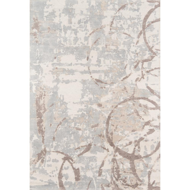
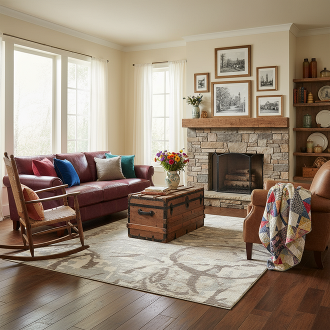
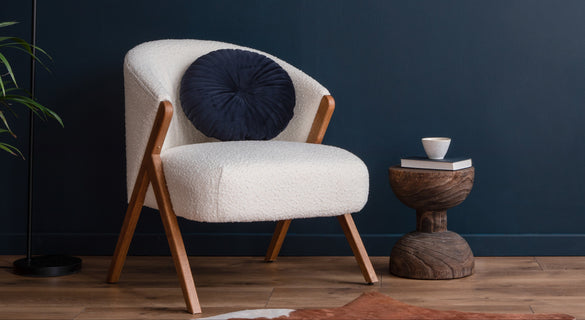
Start with a foundational rug that grounds the space. A flatweave jute or a low-pile wool rug gives you a neutral base that won't fight the furniture. Then let upholstery carry the mid-layer: a linen sofa, a leather chair, a boucle ottoman. Finally, add the accents that create surface interest.
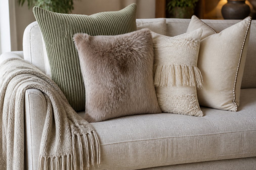
This is where throw pillows do the heaviest lifting. A Boho Textured Fringe Throw Pillow Cover in pure cotton brings a nubby, breathable texture that plays well against smoother upholstery. Pair it with a Sage Green, Corduroy & Faux Fur Throw Pillow Cover for a ribbed-to-plush contrast within the same color family.

Step 5: Mix Smooth and Rough Surfaces Without Clutter
Clutter isn't about how many objects you own. It's about how many competing focal points you create. Smooth and rough surfaces can coexist beautifully as long as they share color harmony or a design narrative.
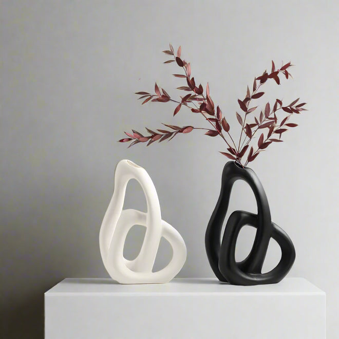
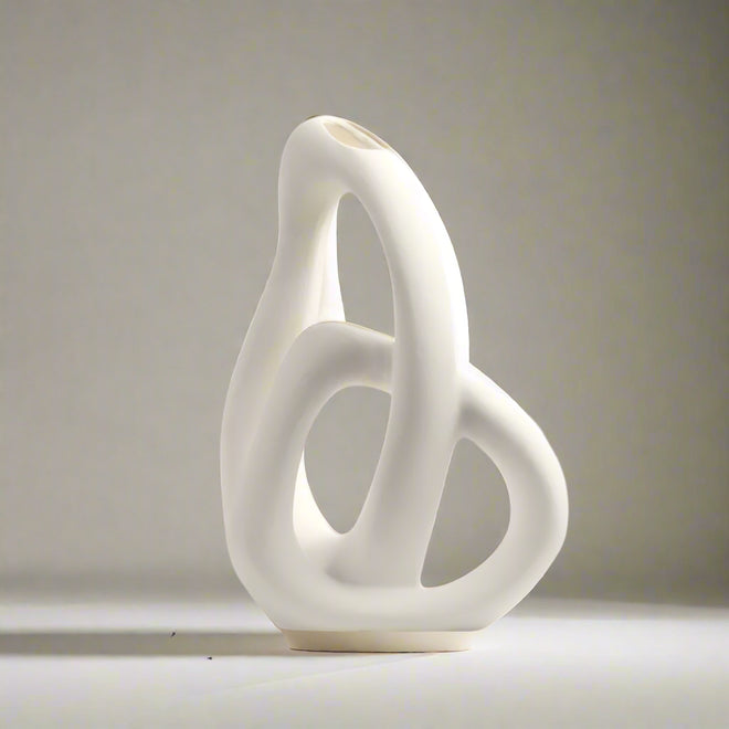
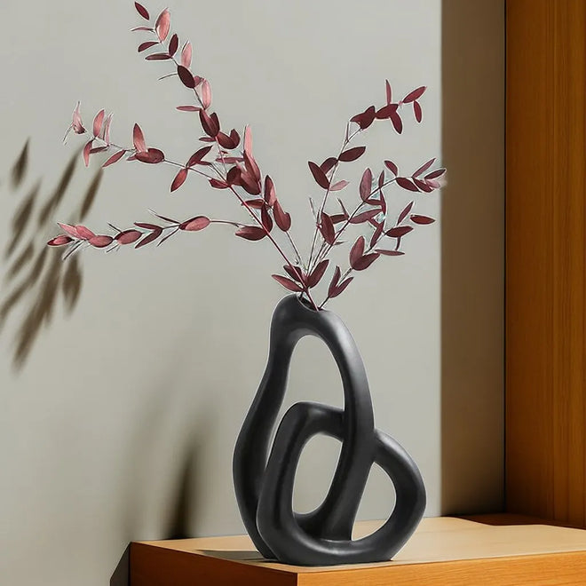
The trick is to limit each surface to one job. A rough, chunky knit blanket adds warmth. A smooth ceramic vase adds reflection. Together they balance. Add a rough burlap wall hanging, a smooth acrylic tray, and a rough sisal basket in the same corner, and the eye has nowhere to rest.
For a Whipstitch Patchwork Cream Suede Throw Pillow Cover, the whipstitch detail itself provides the roughness while the suede base stays smooth. One object, two textures, no clutter. That's the efficient move.
Designers often talk about visual weight, and it's a useful concept here. Heavy textures (chunky wool, thick leather, deep pile) draw the eye. Light textures (sheer linen, glass, thin metal) recede. Distribute weight evenly across the room rather than clustering it.
The Over-Styling Problem Most Guides Skip
Nearly every texture guide tells you how to add. Almost none tell you when to stop. Texture fatigue is the specific condition where every surface carries a pattern, a weave, or a trim, so the eye stops registering any of them individually. The room doesn't look rich, it looks noisy, and the fix is subtraction, not another purchase.
A three-signal diagnostic. A room has tipped past its texture budget when you notice any of these:
- The squint test fails. Squint at the room. If you can't identify one dominant surface family, the contrast has spread too thin.
- Your eye has no landing spot. Scan the room for three seconds. If your gaze bounces between five or more distinct textures with no clear anchor, you have competing focal points.
- You can't name the quiet surface. Every cohesive room has at least one deliberately plain surface, a matte wall, a solid rug, a smooth table, that lets the textured pieces read. If you can't point to it, you don't have one.
The removal protocol. When a room feels busy but you can't say why, don't rearrange, remove. Take out one textured element at a time and pause. The room usually tells you which piece was doing the work and which was just noise. Removing a single high-contrast item can often restore calm faster than adding a "balancing" piece.
Mix High-Maintenance and Low-Maintenance Textures on Purpose
Texture choice is also a durability decision, and this is where cohesion meets real life. High-touch surfaces, velvet, silk, high-pile faux fur, long fringe, trap dust, show crushing, and need more frequent care. Low-touch surfaces, leather, jute, tight wool, matte stone, hide wear and clean easily.
The practical move is to place high-maintenance textures where hands and feet rarely land: a velvet pillow on a high shelf, a silk accent on a console, a faux fur throw on a chair no one sits in daily. Reserve the low-maintenance textures for the surfaces that take abuse, the sofa everyone piles onto, the rug in the traffic path, the ottoman used as a footrest. That way the room keeps its tactile variety without turning every weekend into a cleaning project.
Step 6: An Interior Design Texture Layering Guide for Real Rooms
This interior design texture layering guide condenses the process into a repeatable sequence you can apply room by room. The principle is simple: build depth and dimension through deliberate variation, not accumulation.
The 5-Layer Texture Stack:
- Foundation: one grounding rug in a natural fiber
- Upholstery: two to three fabric types across seating
- Window treatment: one textile that contrasts the upholstery
- Throws: one chunky, one smooth, draped not folded
- Pillows: three textures maximum per seating area
For a Suede Netting Fringed Throw Pillow Cover, the handwoven geometric face and suede fringe give you both pattern integration and tactile contrast in a single piece. That's the kind of efficiency that keeps a room from feeling over-styled.

Common Texture Mixing Mistakes to Avoid
The most frequent mistake is matching texture to texture instead of mixing it. Three velvet pillows on a velvet sofa look like a showroom display, not a home. Variation is what makes a room feel collected rather than purchased in one trip.
Other pitfalls worth knowing:
- Ignoring lighting. Ambient lighting changes how texture reads. A nubby weave looks flat under overhead light and dimensional under a warm lamp. Test new pieces in the room's actual light before committing.
- Forgetting maintenance. High-pile and fringe-heavy textiles trap dust and need more frequent care. If a room gets heavy use, favor tighter weaves and removable covers.
- Overlooking architectural details. Moldings, exposed brick, and beam ceilings are textures too. Work with them rather than covering them up.
- Skipping negative space. Empty wall and clear surface area let the textures you do have breathe.
Conclusion: Your Cohesive Texture Plan
Texture mixing rewards planning more than spending. Map what you own, balance hard against soft, hold to the 70/30 ratio, and layer from the floor up. That sequence alone solves most cohesion problems before you buy anything new.
When you're ready to add the finishing layer, The Finishing Touch Decor, LLC curates throw pillows, vases, wall art, and rugs across French Country, Coastal, Bohemian, and Contemporary styles, with free shipping on orders over $50. Mix a corduroy and faux fur cover with a cotton fringe pillow, and you've built tactile contrast in one afternoon.
Shop now at The Finishing Touch Decor, LLC and give every room a texture story worth touching.
Frequently Asked Questions
How do I mix textures in a neutral room without making it look busy?
Stick to one color family and vary only the surfaces. A cream sofa can hold a corduroy pillow, a faux fur throw, and a smooth leather ottoman because the eye reads contrast in touch, not color. Limit yourself to three to four distinct textures per seating area and repeat one of them elsewhere in the room, like a woven basket or a linen curtain, so the mix feels intentional rather than random.
What is the 70/30 rule in interior design?
The 70/30 rule says about 70 percent of a room's surfaces should be smooth or flat and 30 percent should be textured or tactile. In practice, that means a smooth painted wall, a flat-weave rug, and a sleek coffee table carry the base, while a chunky knit throw, a nubby pillow, and a rough wood bowl add the 30 percent. This ratio keeps a room from feeling either sterile or overstuffed.
Does mixing textures actually help a home look more cohesive?
Yes. Cohesion comes from repeated visual weight and color, not from matching every finish. When you mix textures within the same palette, each surface reflects light differently, which adds depth and makes a room feel collected over time. A monochromatic scheme with varied textures, such as cotton, suede, and metal, often reads as more cohesive than a room where every item is the same material.
How can I use texture to make a neutral room feel more interesting?
Add one high-contrast tactile element per zone. In a beige living room, try a suede or faux fur pillow on a smooth sofa, a jute rug under a glass table, and a ceramic vase with a matte finish next to a glossy lamp. These small swaps change how light moves through the space and give the eye something to explore without introducing new colors.