

Table of Contents
- The 70/30 Rule in Interior Design: Your Foundation for Mixing Styles
- How to Mix Modern and Traditional Decor Without Clashing
- How to Use Accent Pieces to Tie Styles Together
- Room-by-Room: Applying Mixed Styles in Real Spaces
- The Psychology of Mixing Styles: Why Curated Beats Cluttered
- Budget-Conscious Mixing: High-Impact Decor Without the High Price
- Common Mistakes to Avoid When Mixing Interior Design Styles
- Conclusion
- Frequently Asked Questions
Last Updated: September 11, 2026
The 70/30 Rule in Interior Design: Your Foundation for Mixing Styles
Learning how to mix interior design styles effectively starts with one discipline: give one style the lead. The 70/30 rule in interior design means roughly 70% of a room follows a primary style, while 30% comes from a secondary one (edu). The ratio gives a space a clear identity while leaving room for personality.
Think of the 70% as your neutral base, setting the mood: coastal, French Country, Bohemian, or contemporary. The 30% is where contrast lives. A traditional room with modern lighting reads intentional; a modern room with traditional art reads confused if the split is even.
Name your primary style out loud before you shop. If you cannot, you will buy pieces that fight each other.
How to Mix Modern and Traditional Decor Without Clashing
Mixing modern and traditional decor works when the two styles share a bridge: color, material, or line. Pick one bridge and repeat it. A traditional sofa in a modern room needs a modern silhouette nearby, such as a glass coffee table or a clean-lined lamp.
The most common mistake is treating "traditional" as ornate and "modern" as cold. Both styles rely on proportion: a heavy carved armoire next to a slim modern console looks off because the visual weight is unbalanced, not because the styles conflict.
Start with the largest piece. If it is traditional, keep the next two largest pieces modern. If it is modern, let traditional pieces be smaller accents: a framed print, a brass tray, a patterned pillow.
The Three Bridges, Explained
A bridge is a single attribute both styles already share, so you amplify what is there rather than forcing agreement.
- Color bridge. Both styles use neutrals. A cream linen sofa (traditional) and a cream boucle chair (modern) read as one room because the color carries the eye across the style change. Repeat the color in at least three places: upholstery, wall, and one accent.
- Material bridge. Both styles use wood, metal, and glass. A walnut traditional sideboard and a walnut modern coffee table share a species, so the finish connects them. Keep the species consistent and let the silhouette differ.
- Line bridge. Both styles use straight lines and curves. A traditional rolled-arm sofa and a modern arched floor lamp share a curve, so the eye reads them as related despite the era gap.
Pick one bridge per room. Two bridges compete; three bridges disappear.
Named Pairings That Work
Specific pairings are more useful than generic advice because they already share a bridge:
- Mid-century modern + traditional. Bridge on wood tone. A walnut mid-century credenza and a walnut traditional dining table share a species; the mid-century piece supplies the clean line, the traditional piece the weight.
- Contemporary + French Country. Bridge on color. Both lean on cream, soft gray, and muted blue. A contemporary slipcovered sofa and a French Country armoire in the same cream family read as one room.
- Industrial + traditional. Bridge on metal. Black metal hardware on a traditional dresser and a black metal modern floor lamp share a finish, so the industrial piece reads as an accent rather than a clash.
- Scandinavian + traditional. Bridge on light wood and white. Both use pale oak and white walls, making this one of the easiest pairings to pull off without a designer.
The 60/30/10 Variation
The 70/30 rule is the default, but a modern-traditional mix often works better at 60/30/10: 60% primary, 30% secondary, 10% a third accent tying the two together. That 10% is usually a metal, a wood tone, or a single color appearing in both the primary and secondary pieces. Without it, a 60/30 split can read as two rooms in one.
What to Avoid
- Two ornate pieces next to each other. Ornate + ornate reads as one era, not a mix. Pair one ornate piece with one clean-lined piece.
- Matching wood tones too literally. Furniture needs to relate, not match. A warm walnut and a cool gray-washed oak can share a room if a third material, such as black metal or natural linen, sits between them.
- Treating "modern" as "minimal." Modern is a period and a set of lines; minimal is a level of clutter. A modern room can hold a traditional rug and still read modern if the lines stay clean.
How to Use Accent Pieces to Tie Styles Together
Accent pieces are the cheapest way to make two styles agree, because you can swap them without redoing a room. The trick is repetition: choose one motif, one metal, or one color and repeat it three times. Three repeats read as a decision; one reads as an accident.
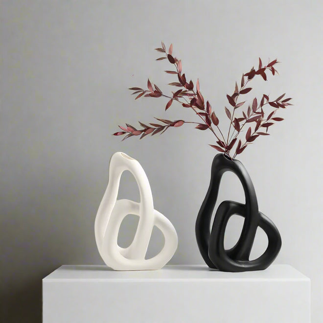
A curated collection beats a random haul. A ceramic vase, a textured lamp, and a set of figurines in the same finish will pull a transitional room together faster than any large purchase.

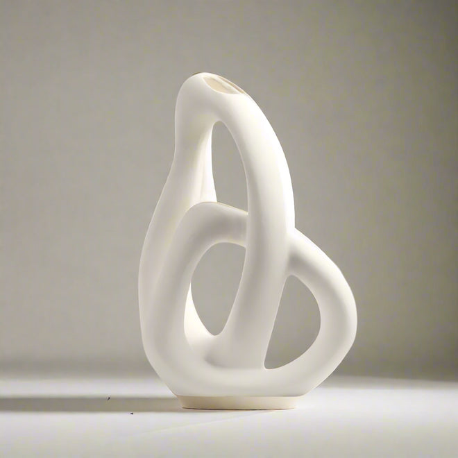
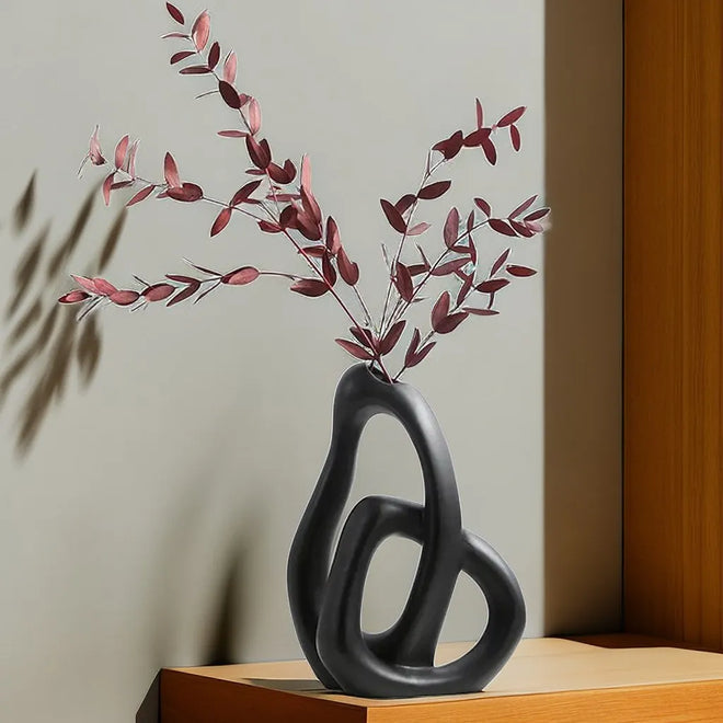
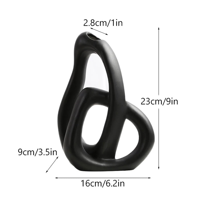
For a modern-traditional mix, try the Brushed Handmade Ceramic Modern Minimalist Vases. The brushed finish reads handmade, which suits traditional rooms, while the silhouette stays clean enough for modern ones. That is the whole principle in one object: old-world texture, modern line.

The Accent Budget: How Many, How Much
Most rooms need three to five accent pieces, not fifteen. The ratio matters more than the number: roughly 70% of accents should echo the primary style, 30% the secondary. If every accent is from the secondary style, the room flips and the primary style disappears.
A practical spend guide, from lowest to highest impact per dollar:
- Pillows and throws. Lowest cost, highest swap-ability. Two pillows in the secondary style can shift a room's read in an afternoon.
- Vases and bowls. Low cost, high visibility. Group in threes on a console or shelf.
- Lamps. Medium cost, high impact, because lighting changes the mood of every surface it touches.
- Art and mirrors. Medium cost, high impact, because they set the focal point.
- Rugs. Highest cost of the accent layer, but they define zones and ground the palette.
Start at the top of the list and work down only when the cheaper layers already look finished.
Where Accents Go: The Rule of Three Surfaces
Accents fail most often because they land on every surface instead of a few. Pick three surfaces per room and leave the rest bare:
- The main surface. The coffee table, the dining table, or the kitchen island. One grouping of three objects.
- The vertical surface. A shelf, a mantel, or a console. One grouping of three objects.
- The floor. A rug, a basket, or a floor lamp. One anchor piece.
Every other surface stays clear. This is the single biggest difference between a room that reads curated and a room that reads cluttered, and it costs nothing to implement.
The Psychology Angle: Why Three Repeats Feel Calm
Visual overwhelm is a cognitive load problem, not a taste problem (peer-reviewed research). When every surface holds a different style, the eye has no focal point to rest on, and the room feels smaller and busier than it is. A focal point gives the brain an entry point; the rest reads as background.
This is why "curated" and "cluttered" describe the same number of objects arranged differently. Three objects that share a motif feel calm; three that share nothing feel chaotic, even in a large room. Repetition is the mechanism that tells the brain where to look first.
The Anti-Style Approach: Breaking the Rules on Purpose
Once you understand the repetition rule, you can break it deliberately. Maximalist and "curated eclectic" rooms work because they repeat a different attribute: color saturation, a single era, or a single material. Mismatched objects in the same saturated palette read as intentional; mismatched objects with no shared attribute read as a storage unit.
The rule is not "repeat a motif." The rule is "repeat something." Pick the attribute, then break every other rule.
Room-by-Room: Applying Mixed Styles in Real Spaces
The same ratio applies differently in each room, because rooms have different jobs. A living room can carry more contrast because it is used in short, social bursts. A bedroom needs less, because contrast at close range reads as noise when you are trying to sleep.
Living Room: Balancing Comfort and Contrast
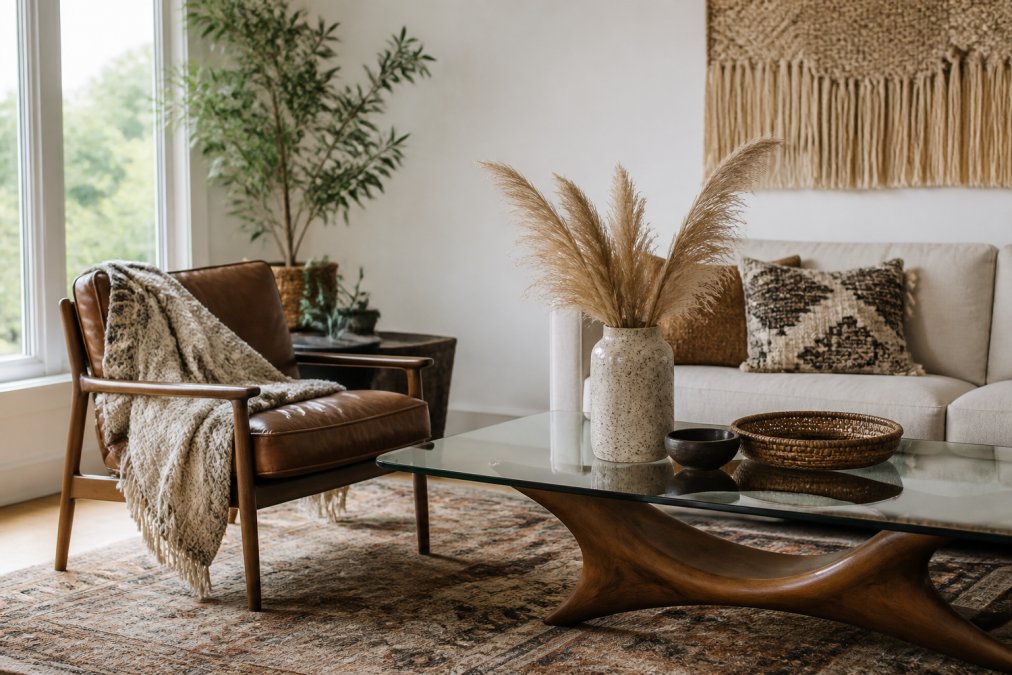
The living room is where you can push the 30% hardest. Anchor the seating in your primary style, then let the secondary style show up in lighting, art, and tables. Symmetry grounds an eclectic room: matching lamps flanking a sofa hold a mismatched collection together.
Bedroom: Creating a Calm, Layered Retreat
In the bedroom, drop the ratio to roughly 80/20 (edu). Keep the bed, bedding, and window treatments in one style family, then introduce the second style in small doses: a lamp, a single piece of wall art, a tray. The Round Rustic Wabi Sabi Ceramic Nordic Textured Table Lamp softens a modern bedroom without introducing a competing style.

The Psychology of Mixing Styles: Why Curated Beats Cluttered
The fix is editing, not buying. Remove one item from every surface and step back. Most rooms improve immediately.
Budget-Conscious Mixing: High-Impact Decor Without the High Price
You do not need to replace furniture to change a room's style mix. Spend on the pieces you touch and see daily, and save on the rest.
| Priority | What to Buy | Why It Matters | Typical Spend |
|---|---|---|---|
| 1 | Lighting | Changes the mood of every surface | Highest impact |
| 2 | Textiles | Adds texture and color cheaply | Low cost |
| 3 | Accent decor | Ties styles together, easy to swap | Lowest cost |
| 4 | Rugs | Defines zones and grounds the palette | Medium cost |
| 5 | Furniture | Anchors the primary style | Highest cost |
Start at the bottom and work up only when the cheaper layers already look finished. A renter can change lighting, textiles, and accents and leave with a room that looks nothing like the one they moved into.
Common Mistakes to Avoid When Mixing Interior Design Styles
The most common mistake is buying one piece from every style you like. A room with five styles has no style. Pick two, and keep the second under 30%.
The second mistake is matching wood tones too literally. Furniture needs to relate, not match. A warm walnut and a cool gray-washed oak can share a room if a third material, such as black metal or natural linen, sits between them.
The third mistake is ignoring scale. A tiny accent on a large wall disappears; an oversized piece in a small room crowds it. Proportion makes a mix look deliberate rather than accidental.
Conclusion
The hard part of mixing styles is not finding beautiful pieces; it is knowing which ones to leave on the shelf. A clear primary style, a disciplined 30% for contrast, and one repeated motif will carry a room further than any statement piece.
The Finishing Touch Decor, LLC curates decor across French Country, Coastal, Bohemian, and Nordic Scandi styles, so you can build a mix without hunting through five stores. Orders over $50 ship free, and the collection is built for this kind of layering: vases, lamps, wall art, and table pieces that repeat a finish or motif across a room.
Shop Now and start with the accents. They are the fastest, most affordable way to make two styles agree.
Frequently Asked Questions
What is the 3-5-7 rule in interior design?
The 3-5-7 rule is a guideline for arranging accessories and decor. It suggests grouping items in odd numbers (3, 5, or 7) to create visual interest. For example, a coffee table might have three objects: a stack of books, a candle, and a small vase. Odd numbers feel more natural and dynamic than even numbers, which can look static. This rule works well when mixing styles because it helps you balance different shapes and sizes without overthinking.
Is it okay to mix different interior design styles?
Yes, mixing styles is not only okay, it's often encouraged. The key is to create a cohesive look by choosing a dominant style and using a secondary style as an accent. The 70/30 rule is a common guideline: 70% of your room reflects one style, and 30% reflects another. This prevents the space from feeling chaotic. When done with intention, mixing styles can make a room feel more personal and curated.
How do you keep a room from looking cluttered when mixing styles?
To avoid clutter, focus on a neutral base for large furniture pieces, then add personality through accents. Use the 70/30 rule to limit the secondary style. Edit your space regularly: remove items that don't serve a purpose or add visual noise. Group similar objects together, and leave some empty space. Layering textures and materials can add depth without adding clutter, as long as you maintain a consistent color palette.
How do you choose a color palette for mixed design styles?
Start with a neutral base (white, beige, gray) for walls and large furniture. Then choose one or two accent colors that appear in both styles you're mixing. For example, if you're blending modern and traditional, a navy blue can work in a modern geometric pillow and a traditional rug. Use the 60-30-10 rule: 60% dominant color, 30% secondary, 10% accent. This creates harmony even when styles differ.